Ask Your Question
1

Adapt 2D-plot tick label attributes to dates

asked 2020-04-27 20:59:05 +0200

MrDvbnhbq gravatar image

updated 2021-04-30 00:29:51 +0200

slelievre gravatar image

Is there a way to access ticks labels to rotate them? I've tried Graphics.matplotlib() and set_rotation(), but this doesn't seem to produce changes. Am I doing wrong things?

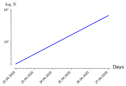
In the example below, the formatter and locator are working correctly, but the problem is all labels are oriented horizontally, messing all together since each tick label is a date and therefore quite long. Need to rotate them.

import csv
from datetime import datetime
from matplotlib import ticker
from matplotlib import dates

data = [('04/22/20', '04/23/20', '04/24/20','04/25/20','04/26/20', '04/27/20'),
        (20, 40, 80, 160, 320, 640)]
labels = data[0]
labels = map(lambda x: dates.date2num(datetime.strptime(x, '%m/%d/%y')), labels)
labels = list(labels)
values = data[1]
values = map(lambda x: int(x), values)

# Z is a list of [(x1, y1), (x2, y2)...]
# x1, x2, ... are dates
# y1, y2, ... are values
Z = zip(labels, values)
Z = list(Z)

p = list_plot(Z, ticks=[1, None],
              tick_formatter=[dates.DateFormatter('%d.%m.%Y'), None],
              axes_labels=['Days', '$\\log \\;{N}$'], plotjoined=True,
              thickness=2, figsize=4, scale='semilogy')
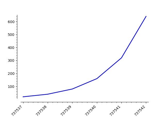
G = p.matplotlib()
labels = G.axes[0].xaxis.get_ticklabels()
labels = list(labels)

for label in labels:
    label.set_rotation(45)

p

This outputs the plot with an ugly x-axis on which all the dates are messed up. How to fix that?

Plot with dates as tick labels on the x-axis

edit retag flag offensive close merge delete

Comments

A minimal example that can by copy-pasted in a fresh Sage session helps others get started on an answering a question, therefore increasing the chances of getting an answer. In this case,

  • include the appropriate import statements so that dates.DateFormatter will work
  • provide an actual Z (with just enough dates to illustrate the problem)
slelievre gravatar imageslelievre ( 2020-04-27 23:35:46 +0200 )edit

Hello, thank you for your response. I've added the information needed to comply.

MrDvbnhbq gravatar imageMrDvbnhbq ( 2020-04-28 12:33:34 +0200 )edit

Following what is explained in this link, it seems the following should work:

sage: figure = p.matplotlib()
sage: figure.autofmt_xdate(rotation=45)
sage: figure.savefig('a.png')

but the last line returns an error because figure.canvas is None

Sébastien gravatar imageSébastien ( 2020-04-28 20:26:40 +0200 )edit

Yes, thanks for this answer. I've already tried that with the same result. But this example is for pure matplotlib, not the sage Graphics object. I would like to know, what does that matplotlib() exactly do? I even tried:

from matplotlib.pyplot import figure
...   
fig = figure()
fig = p.matplotlib(fig)
...

to draw the plot on the new figure provided, but this doesn't work for me. So, the question is, is this matplotlib() function supposed to give the access to p attributes, which were previosly set when the plot was created, and should the changes made on the figure effect onto the plot? And is the plot is supposed to be redrawn on the new figure when the plot is passed as an argument to matplotlib()?

MrDvbnhbq gravatar imageMrDvbnhbq ( 2020-04-28 21:35:07 +0200 )edit

Suggestion: format dates following the international standard ISO 8601.

slelievre gravatar imageslelievre ( 2020-04-29 14:49:40 +0200 )edit

2 Answers

Sort by » oldest newest most voted
6

answered 2020-04-29 00:12:50 +0200

dsejas gravatar image

updated 2020-05-25 00:19:01 +0200

Hello, @MrDvbnhbq! I can see that you already got an answer for your question. However, I have an alternative approach.

As far as I know, there is no direct way to do this in SageMath, so we are going to use a mix of Sage plots and Matplotlib plots, i.e., we will use the matplotlib() command. All the arguments that you passed to list_plot() can be passed to the matplotlib() command, except for the thickness and the plotjoined parameters, which are exclusive of the former.

Consider the following instructions:

%matplotlib inline
import csv
from datetime import datetime
from matplotlib import ticker
from matplotlib import dates
import matplotlib.pyplot as plt

data = [ ( '04/22/20', '04/23/20', '04/24/20','04/25/20','04/26/20', '04/27/20' ), (20, 40, 80, 160, 320, 640) ]
labels = data[0]
labels = map(lambda x: dates.date2num(datetime.strptime(x, '%m/%d/%y')), labels)
labels = list(labels)
values = data[1]
values = map(lambda x: int(x), values)

Z = zip(labels, values)
Z = list(Z)

p = list_plot(Z, plotjoined=true, thickness=2)

G = p.matplotlib(figure=plt.gcf(),scale='semilogy',tick_formatter=[dates.DateFormatter('%d.%m.%Y'), None], axes_labels=[ 'Days', '$\\log \\;{N}$' ], ticks=[1, None], figsize=4)
G.autofmt_xdate(rotation=45)
G.show()

I have made only three changes to your code:

  1. I have used the magic %matplotlib inline as the first line, so that Matplotlib figures are shown in SageCell or Jupyter(lab).
  2. I have imported pyplot under the name plt on line 6.
  3. I have moved all the arguments you used in list_plot to the matplotlib() command, including the additional argument figure=plt.gcf().
  4. Concerning the rotation of the xticks, I used the G.autofmt_xdate(rotation=45) command. However, you can also use the plt.xticks(rotation=45) instruction; since Matplotlib already knows you are working with the current figure (that's the plt.gcf()), it will apply the changes directly to it, in that case.

That's it!

By the way, you can remove the G.show() line, which I included for completeness.

The problem with your previous approach, and @Sébastien's is that the matplotlib() command does not preserve the semilog y-axis, nor the ticks formatter, etc. So, instead of using those options in list_plot where they will be overwritten later by matplotlib(), I passed them to the latter, so it can't ignore them.

The final result should look like this:

image description

I hope this helps!

edit flag offensive delete link more

Comments

Looks good ! The interface between Sage and the underlying matplotlib, and the possilibty go work on that backend should be clarified and polished. Do you have an idea why some options passed to Sage (e.g. semilog y-axis) are not transfered to matplotlib ?

tmonteil gravatar imagetmonteil ( 2020-04-29 01:50:34 +0200 )edit
2

Also, since you seem at ease with the graphic internals, did you consider helping in improving that part of Sage ?

tmonteil gravatar imagetmonteil ( 2020-04-29 02:02:37 +0200 )edit

Hello, @tmonteil! As for your first question, yes, I know why some options passed to Sage are not transferred to Matplotlib. The reason is that the matplotlib() command has some of the same arguments as the list_plot command, and those have default values, which are not overwritten by the Sage plot properties.

Let me give you an example. Suppose you use the following command:

q = p.matplotlib()

where p is a plot. If you check the signature of this method, you will notice it has the argument axes with default value None. As expected, when you don't use the axes argument here, it assumes the value None. However, the following that should happen in this case is that the code should use the axes value set for p, but That doesn't happen!

It should be easy to fix.

dsejas gravatar imagedsejas ( 2020-04-29 07:51:51 +0200 )edit
2

Continuing with your second question, @tmonteil, yes, I would be happy to help improving the Sage-Matplotlib interface. Actually, I've been thinking this for a long time. There is also much to improve in the 3d plots capabilities (check, for example, this question).

The following two weeks I am going to be very busy, but then I can start adding some improvements. Is there a recommended way to proceed? Should I work freely or should I pass every decision through the sage-devel forum?

dsejas gravatar imagedsejas ( 2020-04-29 08:10:33 +0200 )edit

A discussion on sage-devel is needed when two persons do not agree on a decision and they ask on sage-devel for comments to get some consensus. In your case, you propose a clear improvement so such a discussion will not be needed. I suggest you to create a ticket, post a branch and reviewers will check it.

Sébastien gravatar imageSébastien ( 2020-04-29 09:24:12 +0200 )edit
3

answered 2020-04-28 21:21:37 +0200

Sébastien gravatar image

updated 2020-04-28 22:06:15 +0200

Ok, so it seems what was missing is the "get current graphics", see this other question. Now this works:

sage: import matplotlib.pyplot as mpl
sage: figure = p.matplotlib(figure=mpl.gcf())
sage: figure.autofmt_xdate(rotation=45)
sage: figure.show()
sage: figure.savefig('a.png')

image description

But then, the dates and log y scales need more work. There must be a way to fix this... Alternatively, you may use pandas (which is an optional python library that one can install by doing sage -pip install pandas):

sage: from datetime import datetime
sage: data = [ ( '04/22/20', '04/23/20', '04/24/20','04/25/20','04/26/20', '04/27/20'), (20, 40, 80,160, 320, 640) ]
sage: labels = [datetime.strptime(x, '%m/%d/%y') for x in data[0]]
sage: values = [int(a) for a in data[1]]
sage: import pandas as pd
sage: df = pd.DataFrame({'dates':labels,'values':values})
sage: df
       dates  values
0 2020-04-22      20
1 2020-04-23      40
2 2020-04-24      80
3 2020-04-25     160
4 2020-04-26     320
5 2020-04-27     640
sage: df.plot(x='dates', y='values', title='title', rot=30, logy=True, figsize=[4,4], yticks=[10,100,1000])

image description

For the image to appear in a Jupyter notebook, add the following in the first cell:

%matplotlib inline
edit flag offensive delete link more

Comments

Aha!.. That's a pretty nice solution. Will definitely dig deeper into pandas too. Thanks a lot for your help! Cheers 👍

MrDvbnhbq gravatar imageMrDvbnhbq ( 2020-04-28 22:27:40 +0200 )edit

Your Answer

Please start posting anonymously - your entry will be published after you log in or create a new account.

Add Answer

Question Tools

2 followers

Stats

Asked: 2020-04-27 20:59:05 +0200

Seen: 719 times

Last updated: Apr 30 '21