Revision history [back]
| | 1 | initial version |
Sometimes, when I am not able to get all the control on this kind of graphics, I like to use pandas (which is an optional python library that one can install by doing sage -pip install pandas):
sage: from datetime import datetime
sage: data = [ ( '04/22/20', '04/23/20', '04/24/20','04/25/20','04/26/20', '04/27/20'), (20, 40, 80,160, 320, 640) ]
sage: labels = [datetime.strptime(x, '%m/%d/%y') for x in data[0]]
sage: values = [int(a) for a in data[1]]
sage: import pandas as pd
sage: df = pd.DataFrame({'dates':labels,'values':values})
sage: df
       dates  values
0 2020-04-22      20
1 2020-04-23      40
2 2020-04-24      80
3 2020-04-25     160
4 2020-04-26     320
5 2020-04-27     640
sage: df.plot(x='dates', y='values', title='title', rot=30, logy=True, figsize=[4,4], yticks=[10,100,1000])
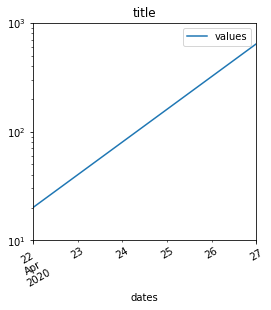
For the image to appear in a Jupyter notebook, add the following in the first cell:
%matplotlib inline
| | 2 | No.2 Revision |
Sometimes, when I am Ok, so it seems what was missing is the "get current graphics", see this other question. Now this works:
sage: import matplotlib.pyplot as mpl
sage: figure = p.matplotlib(figure=mpl.gcf())
sage: figure.autofmt_xdate(rotation=45)
sage: figure.show()
sage: figure.savefig('a.png')
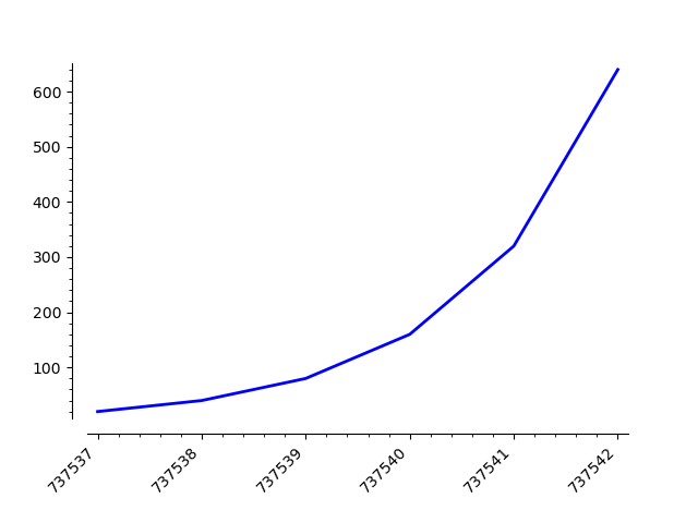
But then, the dates and log y scales do not able work. There must be a way to get all the control on this kind of graphics, I like to fix this...
Alternatively, you may use pandas (which is an optional python library that one can install by doing sage -pip install pandas):
sage: from datetime import datetime
sage: data = [ ( '04/22/20', '04/23/20', '04/24/20','04/25/20','04/26/20', '04/27/20'), (20, 40, 80,160, 320, 640) ]
sage: labels = [datetime.strptime(x, '%m/%d/%y') for x in data[0]]
sage: values = [int(a) for a in data[1]]
sage: import pandas as pd
sage: df = pd.DataFrame({'dates':labels,'values':values})
sage: df
       dates  values
0 2020-04-22      20
1 2020-04-23      40
2 2020-04-24      80
3 2020-04-25     160
4 2020-04-26     320
5 2020-04-27     640
sage: df.plot(x='dates', y='values', title='title', rot=30, logy=True, figsize=[4,4], yticks=[10,100,1000])
For the image to appear in a Jupyter notebook, add the following in the first cell:
%matplotlib inline
| | 3 | No.3 Revision |
Ok, so it seems what was missing is the "get current graphics", see this other question. Now this works:
sage: import matplotlib.pyplot as mpl
sage: figure = p.matplotlib(figure=mpl.gcf())
sage: figure.autofmt_xdate(rotation=45)
sage: figure.show()
sage: figure.savefig('a.png')
But then, the dates and log y scales do not need more work. There must be a way to fix this...
this... Alternatively, you may use pandas (which is an optional python library that one can install by doing sage -pip install pandas):
sage: from datetime import datetime
sage: data = [ ( '04/22/20', '04/23/20', '04/24/20','04/25/20','04/26/20', '04/27/20'), (20, 40, 80,160, 320, 640) ]
sage: labels = [datetime.strptime(x, '%m/%d/%y') for x in data[0]]
sage: values = [int(a) for a in data[1]]
sage: import pandas as pd
sage: df = pd.DataFrame({'dates':labels,'values':values})
sage: df
       dates  values
0 2020-04-22      20
1 2020-04-23      40
2 2020-04-24      80
3 2020-04-25     160
4 2020-04-26     320
5 2020-04-27     640
sage: df.plot(x='dates', y='values', title='title', rot=30, logy=True, figsize=[4,4], yticks=[10,100,1000])
For the image to appear in a Jupyter notebook, add the following in the first cell:
%matplotlib inline
