Hello, @stockh0lm. You ask a very interesting question. I just found a solution, but I don't think it's the most elegant one. I would suggest you to keep looking for another option, but meanwhile...
We are going to mix SageMath plots with pure Matplotlib plots, so you need to import Matplotlib with the line
import matplotlib.pyplot as mpl
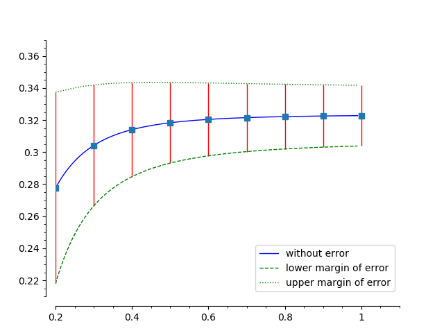
I took the following from another of your questions, and made a few changes (the colors and line styles). We will work with this. We are also going to take advantage of your already defined f(), f_lower() and f_upper().
plot([f, f_lower, f_upper],(x,0.2,0.99), color=['blue', 'green', 'green'], linestyle=['-', '--', ':'],
     legend_label=['without error',  'lower margin of error', 'upper margin of error'],
     axes_labels=['cable\'s burial depth in [m]','Potential in [V]'],
     figsize=8, axes_labels_size=1, title='$U$ is without error', title_pos=(0.5,1.1)
).matplotlib(figure=mpl.gcf())
Note the ".matplotlib(figure=mpl.gcf())" at the end? This is because, as you know, "plot" is a purely SageMath command. So this is a directive to convert it to a Matplotlib-compatible figure. In particular, saying "figure=mpl.gcf()" indicates to add this plot to the current graphic (gcf="get current graphics").
You'll probably need to adjust the axis ranges a little bit to make a more elegant figure. In this case, after some try-and-error, I figured this will make it:
mpl.axis([0.2, 1.1, 0.21, 0.37])
Now we are going to create some lists for the $x$ and $y$ coordinates of the error, and the lower and upper length of the bars:
xx = [] # this will contain the $x$ coordinate
yy = [] # this will contain the $y$ coordinate
el = [] # the lower length of the error box
eu = [] # the upper length of the error box
Now we will fill them. I am assuming that your $x$-axis is from 0.2 to 1.0, and I will use a step of 0.1:
for i in range(2, 11):
t = 0.1 * i
v = N(f(t)) # I use the function N() to convert to RIF to float
xx += [t]
yy += [v]
el += [v - f_lower(t)]
eu += [f_upper(t) - v]
Now we use the errorbar() function from Matplotlib:
mpl.errorbar(xx, yy, [el, eu], ecolor='r', elinewidth=1, marker='s', fmt=' ')
Note there is a space between the last quotation marks. This es in order to ask Matplotlib to only draw the error bars and not the lines linking them, since we don't want lines, but the the original function, which we plot next. The argument "ecolor" defines the color of the error bars (b = "blue"), the "elinewidth" define its thickness, and the "marker" indicates a marker for the location of the error bar (s = "square").
Now you have to plot it, not using SageMath, but Matplotlib:
mpl.savefig('Error_bars.png')
That's it! Phew. Quite cumbersome, but effective. The result should look like follows, but you can adjust it at your convenience.
You can read more about Matplotlib's errorbar() here. You can check a mix of my code with yours (the one that produced the image) here.
Best regards!

Can you provide code for a function you would like such a plot for?
i meant to do so, thanks for the reminder.