Revision history [back]
| | 1 | initial version |
Hello, @MrDvbnhbq! I can see that you already got an answer for your question. However, I have an alternative approach.
As far as I know, there is no direct way to do this in SageMath, so we are going to use a mix of Sage plots and Matplotlib plots, i.e., we will use the matplotlib() command. All the arguments that you passed to list_plot() can be passed to the matplotlib() command, except for the thichness and the plotjoined parameters, which are exclusive of the former.
Consider the following instructions:
%matplotlib inline
import csv
from datetime import datetime
from matplotlib import ticker
from matplotlib import dates
import matplotlib.pyplot as plt

data = [ ( '04/22/20', '04/23/20', '04/24/20','04/25/20','04/26/20', '04/27/20' ), (20, 40, 80, 160, 320, 640) ]
labels = data[0]
labels = map(lambda x: dates.date2num(datetime.strptime(x, '%m/%d/%y')), labels)
labels = list(labels)
values = data[1]
values = map(lambda x: int(x), values)

Z = zip(labels, values)
Z = list(Z)

p = list_plot(Z, plotjoined=true, thickness=2)

G = p.matplotlib(figure=plt.gcf(),scale='semilogy',tick_formatter=[dates.DateFormatter('%d.%m.%Y'), None], axes_labels=[ 'Days', '$\\log \\;{N}$' ], ticks=[1, None], figsize=4)
G.autofmt_xdate(rotation=45)
G.show()
I have made only three changes to your code:
- I have used the magic
%matplotlib inlineas the first line, so that Matplotlib figures are shown in SageCell or Jupyter(lab). - I have imported
pyplotunder the nameplton line 6. - I have moved all the arguments you used in
list_plotto thematplotlib()command, including the additional argumentfigure=plt.gcf(). - Concerning the rotation of the xticks, I used the
G.autofmt_xdate(rotation=45)command. However, you can also use theplt.xticks(rotation=45)instruction; since Matplotlib already knows you are working with the current figure (that's theplt.gcf()), it will apply the changes directly to it, in that case.
That's it!
By the way, you can remove the G.show() line, which I included for completeness.
The problem with your previous approach, and @Sébastien's is that the matplotlib() command does not preserve the semilog y-axis, nor the ticks formatter, etc. So, instead of using those options in list_plot where they will be overwritten later by matplotlib(), I passed them to the latter, so it can't ignore them.
I hope this helps!
| | 2 | No.2 Revision |
Hello, @MrDvbnhbq! I can see that you already got an answer for your question. However, I have an alternative approach.
As far as I know, there is no direct way to do this in SageMath, so we are going to use a mix of Sage plots and Matplotlib plots, i.e., we will use the matplotlib() command. All the arguments that you passed to list_plot() can be passed to the matplotlib() command, except for the thichness and the plotjoined parameters, which are exclusive of the former.
Consider the following instructions:
%matplotlib inline
import csv
from datetime import datetime
from matplotlib import ticker
from matplotlib import dates
import matplotlib.pyplot as plt

data = [ ( '04/22/20', '04/23/20', '04/24/20','04/25/20','04/26/20', '04/27/20' ), (20, 40, 80, 160, 320, 640) ]
labels = data[0]
labels = map(lambda x: dates.date2num(datetime.strptime(x, '%m/%d/%y')), labels)
labels = list(labels)
values = data[1]
values = map(lambda x: int(x), values)

Z = zip(labels, values)
Z = list(Z)

p = list_plot(Z, plotjoined=true, thickness=2)

G = p.matplotlib(figure=plt.gcf(),scale='semilogy',tick_formatter=[dates.DateFormatter('%d.%m.%Y'), None], axes_labels=[ 'Days', '$\\log \\;{N}$' ], ticks=[1, None], figsize=4)
G.autofmt_xdate(rotation=45)
G.show()
I have made only three changes to your code:
- I have used the magic
%matplotlib inlineas the first line, so that Matplotlib figures are shown in SageCell or Jupyter(lab). - I have imported
pyplotunder the nameplton line 6. - I have moved all the arguments you used in
list_plotto thematplotlib()command, including the additional argumentfigure=plt.gcf(). - Concerning the rotation of the xticks, I used the
G.autofmt_xdate(rotation=45)command. However, you can also use theplt.xticks(rotation=45)instruction; since Matplotlib already knows you are working with the current figure (that's theplt.gcf()), it will apply the changes directly to it, in that case.
That's it!
By the way, you can remove the G.show() line, which I included for completeness.
The problem with your previous approach, and @Sébastien's is that the matplotlib() command does not preserve the semilog y-axis, nor the ticks formatter, etc. So, instead of using those options in list_plot where they will be overwritten later by matplotlib(), I passed them to the latter, so it can't ignore them.
The final result should look like this:
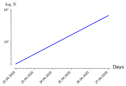
I hope this helps!
| | 3 | No.3 Revision |
Hello, @MrDvbnhbq! I can see that you already got an answer for your question. However, I have an alternative approach.
As far as I know, there is no direct way to do this in SageMath, so we are going to use a mix of Sage plots and Matplotlib plots, i.e., we will use the matplotlib() command. All the arguments that you passed to list_plot() can be passed to the matplotlib() command, except for the thichnessthicknessplotjoined parameters, which are exclusive of the former.
Consider the following instructions:
%matplotlib inline
import csv
from datetime import datetime
from matplotlib import ticker
from matplotlib import dates
import matplotlib.pyplot as plt

data = [ ( '04/22/20', '04/23/20', '04/24/20','04/25/20','04/26/20', '04/27/20' ), (20, 40, 80, 160, 320, 640) ]
labels = data[0]
labels = map(lambda x: dates.date2num(datetime.strptime(x, '%m/%d/%y')), labels)
labels = list(labels)
values = data[1]
values = map(lambda x: int(x), values)

Z = zip(labels, values)
Z = list(Z)

p = list_plot(Z, plotjoined=true, thickness=2)

G = p.matplotlib(figure=plt.gcf(),scale='semilogy',tick_formatter=[dates.DateFormatter('%d.%m.%Y'), None], axes_labels=[ 'Days', '$\\log \\;{N}$' ], ticks=[1, None], figsize=4)
G.autofmt_xdate(rotation=45)
G.show()
I have made only three changes to your code:
- I have used the magic
%matplotlib inlineas the first line, so that Matplotlib figures are shown in SageCell or Jupyter(lab). - I have imported
pyplotunder the nameplton line 6. - I have moved all the arguments you used in
list_plotto thematplotlib()command, including the additional argumentfigure=plt.gcf(). - Concerning the rotation of the xticks, I used the
G.autofmt_xdate(rotation=45)command. However, you can also use theplt.xticks(rotation=45)instruction; since Matplotlib already knows you are working with the current figure (that's theplt.gcf()), it will apply the changes directly to it, in that case.
That's it!
By the way, you can remove the G.show() line, which I included for completeness.
The problem with your previous approach, and @Sébastien's is that the matplotlib() command does not preserve the semilog y-axis, nor the ticks formatter, etc. So, instead of using those options in list_plot where they will be overwritten later by matplotlib(), I passed them to the latter, so it can't ignore them.
The final result should look like this:
I hope this helps!
