This helped me to fix the label on my colorbar, and I have consistent fonts now, too. yay.
however two issues remain:
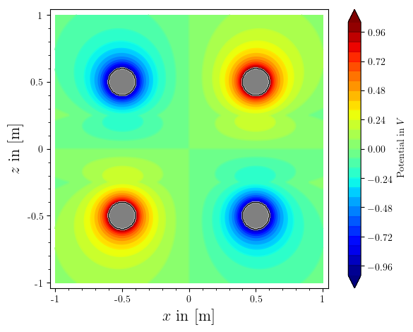
# Region where contour lines should be plotted
def region_to_include(x,y):
    return (x-.5)^2+(y-.5)^2>0.01 and (x+.5)^2+(y-.5)^2>0.01 and (x-.5)^2+(y+.5)^2>0.01 and (x+.5)^2+(y+.5)^2>0.01
# Region to be excluded
def region_to_exclude(x,y):
    return not region_to_include(x,y)


#=================== visual plausibility check
pic=phi_ges.subs({
    Q   : 1e-9,
    d_e : 1,
    z_s : .25,
    z_c : .5,
    epsilon_m : 76,
    epsilon_s : 21.75,
    epsilon_0 : 8.854187817e-12
})

from matplotlib import rc, rcParams
rc('text',usetex=True)
rc('font',**{'family':'serif','serif':['Computer Modern']})


c = contour_plot(pic, (x,-1,1), (z,-1,1), region=region_to_include, contours= 30, plot_points=200, cmap=colormaps.jet, colorbar=True, axes_labels=['$x$ in [m]','$z$ in [m]'], typeset='latex', frame=True, axes=False)
plt=c[0]
opt = plt.options()
opt['colorbar_options']['label'] = 'Potential in $V$'
plt.set_options(opt)
c[0] = plt


# Plot of the region to be excluded
r = region_plot(region_to_exclude, (x,-.1,1), (z,-1,1),
                plot_points=300, incol="gray", bordercol="black", borderwidth=1)


# Final plot
show(c + r,)
bild=c + r
bild.save('potentialfeld.pdf')
gives me a plot like this:
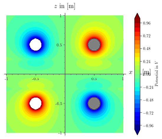
why does my frame=True, axes=False get ignored in the first plot command?
why are the poles on the right side grayed out, but not the ones on the left?
how to fix?