Doing a plot with sage-jupyterhub gets different result than on CoCalc
Hi, we have an educational software where we use Jupyterhub to serve collaborative coding exercises. We've recently added support for Sage using sagemath-jupyter. An instructor complained that code he wrote to generate an image resulted in a very different image when run on CoCalc, and when run using our system. Since I am not familiar with Sage, and there are no errors produced, I have no idea where to go to debug this problem.
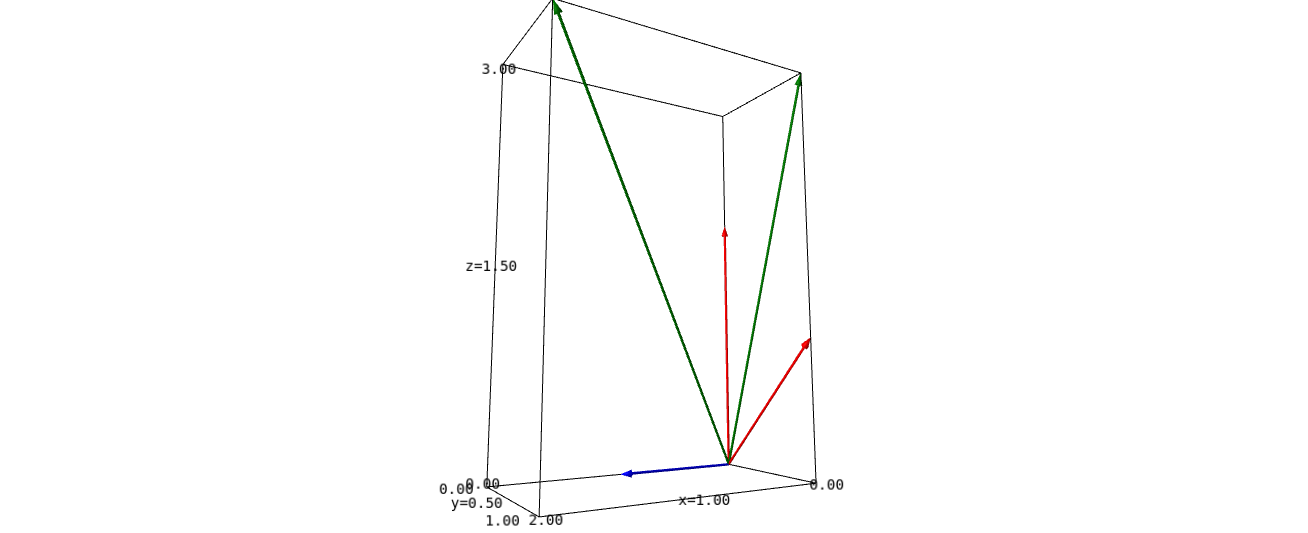
Here's the code:
### Skeleton code for first diagram.
A = matrix([[0,0,0],[1,0,0],[1,2,0]]).transpose()

#Define row basis vectors
row_v1 = vector([0,1,1])
row_v2 = vector([0,0,2])

#Define null basis vector
null_v1 = vector([1,0,0])

# vector in row space
arrow = vector([0,1,3])

u_v = vector([2,1,3])

#Plot vectors
figDomainVecs = plot(row_v1,color="red")+plot(row_v2,color="red")+plot(null_v1,color="blue")+plot(arrow, color="green")+plot(u_v,color='green')
show(figDomainVecs,aspect_ratio=1, viewer="threejs", online=True)
Here is the image our Jupyterhub installation produces https://imgur.com/12xFtMr
And here is how it looks on CoCalc https://imgur.com/HB7eIQ7
any ideas?
thanks!
add a comment