Revision history [back]
| | 1 | initial version |
Once a graphics object is created, plenty of methods let you get or set many of its features.
Among them,
- the method
axes_colorlets you get or set the axes color - the method
tick_label_colorlets you get or set the tick label color
Let us illustrate on an example.
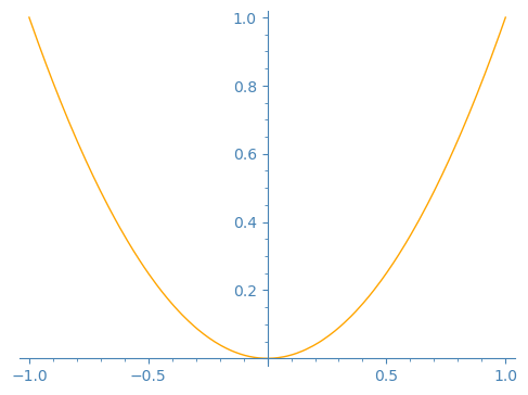
Create a graph with transparent background:
sage: p = plot(x^2, color='orange', transparent=True)
Check what the axes color and tick label color are set to:
sage: p.axes_color(), p.tick_label_color()
((0, 0, 0), (0, 0, 0))
Change them:
sage: p.axes_color('steelblue')
sage: p.tick_label_color('steelblue')
View the graph with its new axes and tick label color:
sage: p
Launched png viewer for Graphics object consisting of 1 graphics primitive
| | 2 | No.2 Revision |
Once a graphics object is created, plenty of Graphics objects have methods
let you to get or set many of its features.their settings.
Among them,these methods,
- the method
axes_colorlets you get or set the axes color - the method
tick_label_colorlets you get or set the tick label color
Let us illustrate them on an example.
Create a graph with transparent background:
sage: p = plot(x^2, color='orange', transparent=True)
Check what the axes color and tick label color are set to:
sage: p.axes_color(), p.tick_label_color()
((0, 0, 0), (0, 0, 0))
Change them:
sage: p.axes_color('steelblue')
sage: p.tick_label_color('steelblue')
View the graph with its new axes and tick label color:
sage: p
Launched png viewer for Graphics object consisting of 1 graphics primitive
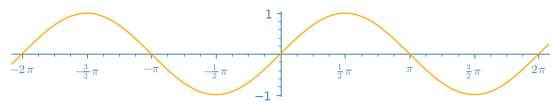
The axes are, as usual, on top of the plot.
To have the graph on top of the axes, set the z-order when plotting.
sage: opt = {'transparent': True, 'ticks': [pi/2, 1], 'tick_formatter': [pi, None], 'aspect_ratio': 1}
sage: q = plot(sin, (-7, 7), color='orange', zorder=3, **opt)
sage: q.axes_color('steelblue')
sage: q.tick_label_color('steelblue')
sage: q.show(xmin=-6.28, xmax=6.28)
| | 3 | No.3 Revision |
Graphics objects have methods to get or set many of their settings.
Among these methods,
- the method
axes_colorlets you get or set the axes color - the method
tick_label_colorlets you get or set the tick label color
Let us illustrate them on an example.
Create a graph with transparent background:
sage: p = plot(x^2, color='orange', transparent=True)
Check what the axes color and tick label color are set to:
sage: p.axes_color(), p.tick_label_color()
((0, 0, 0), (0, 0, 0))
Change them:
sage: p.axes_color('steelblue')
sage: p.tick_label_color('steelblue')
View the graph with its new axes and tick label color:
sage: p
Launched png viewer for Graphics object consisting of 1 graphics primitive
The axes are, as usual, on top of the plot.
To have the graph on top of the axes, set the z-order when plotting.
sage: opt = {'transparent': True, 'ticks': {'ticks': [pi/2, 1], 'tick_formatter': [pi, None], 'aspect_ratio': 1}
sage: q = plot(sin, (-7, 7), transparent=True, color='orange', zorder=3, **opt)
sage: q.axes_color('steelblue')
sage: q.tick_label_color('steelblue')
sage: q.show(xmin=-6.28, xmax=6.28)
| | 4 | No.4 Revision |
Graphics objects have methods
methods to get or set many of their settings.
Among these methods,
- the method
axes_colorlets you get or set the axes color - the method
axes_label_colorlets you get or set the axes label color - the method
tick_label_colorlets you get or set the tick label color
Let us illustrate them on an example.
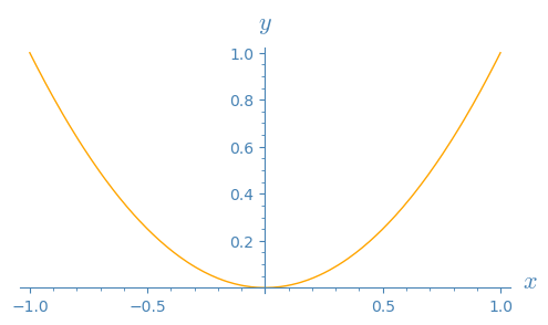
Create a graph with transparent background:
sage: p = plot(x^2, color='orange', transparent=True)
To know what methods exist for p, explore using TAB completion:
after having evaluated the assignment p = plot(x^2) above,
type p. then press the TAB key.
Check what the axes color color, axes label color, and tick label color are set to:
sage: p.axes_color(), p.axes_label_color(), p.tick_label_color()
((0, 0, 0), (0, 0, 0), (0, 0, 0))
They are all black. Change them:
sage: p.axes_color('steelblue')
sage: p.axes_label_color('steelblue')
sage: p.tick_label_color('steelblue')
View the graph with its new axes axes, axes label, and tick label color:
sage: p
Launched png viewer for Graphics object consisting of 1 graphics primitive
p.show(aspect_ratio=1, figsize=5)
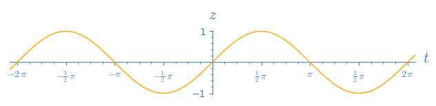
The axes are, as usual, on top of the plot.
To have the graph on top of the axes, set the z-order when plotting.
sage: opt = {'ticks': [pi/2, 1], (pi/2, 1), 'tick_formatter': [pi, None], 'aspect_ratio': 1}
(pi, None), 'transparent': True}
sage: q = plot(sin, (-7, 7), transparent=True, axes_labels=('$t$', '$z$'), color='orange', zorder=3, **opt)
sage: q.axes_color('steelblue')
sage: q.axes_label_color('steelblue')
sage: q.tick_label_color('steelblue')
sage: q.show(xmin=-6.28, xmax=6.28)
| | 5 | No.5 Revision |
Graphics objects have methods to get or set many of their settings.
Among these methods,
- the method
axes_colorlets you get or set the axes color - the method
axes_label_colorlets you get or set the axes label color - the method
tick_label_colorlets you get or set the tick label color
Let us illustrate them on an example.
Create a graph with transparent background:
sage: p = plot(x^2, color='orange', transparent=True)
To know what methods exist for p, explore using TAB completion:
after having evaluated the assignment type p = plot(x^2) above,
p. then press the TAB key.
This reveals, among other methods, axes_color, axes_label_color, tick_label_color.
Explore the documentation with ?, for instance p.axes_color?
and find out that, if called with no argument, it gets the current
setting of axes color, and if called with an argument, it sets the
axes color to that value.
Check what the axes color, axes label color, and tick label color are set to:
sage: p.axes_color(), p.axes_label_color(), p.tick_label_color()
((0, 0, 0), (0, 0, 0), (0, 0, 0))
They are all black. Change them:
sage: p.axes_color('steelblue')
sage: p.axes_label_color('steelblue')
sage: p.tick_label_color('steelblue')
View the graph with its new axes, axes label, and tick label color:
sage: p.show(aspect_ratio=1, figsize=5)
The axes are, as usual, displayed on top of the plot.graph,
as if the graph was behind or under them.
To have the graph on top of the axes, axes instead, set the z-order when plotting.
sage: opt = {'ticks': (pi/2, 1), 'tick_formatter': (pi, None), 'transparent': True}
sage: q = plot(sin, (-7, 7), axes_labels=('$t$', '$z$'), color='orange', zorder=3, **opt)
sage: q.axes_color('steelblue')
sage: q.axes_label_color('steelblue')
sage: q.tick_label_color('steelblue')
sage: q.show(xmin=-6.28, xmax=6.28, aspect_ratio=1)
| | 6 | No.6 Revision |
Graphics objects have methods to get or set many of their settings.
Among these methods,
- the method
axes_colorlets you get or set the axes color - the method
axes_label_colorlets you get or set the axes label color - the method
tick_label_colorlets you get or set the tick label color
Let us illustrate them on an example.
Create a graph with transparent background:background and axes labels:
sage: p = plot(x^2, color='orange', transparent=True)
transparent=True, axes_labels=('$x$', '$y$'))
To know what methods exist for p, explore using TAB completion:
type p. then press the TAB key.
This reveals, among other methods, axes_color, axes_label_color, tick_label_color.
Explore the documentation with ?, for instance p.axes_color?
and find out that, if called with no argument, it gets the current
setting of axes color, and if called with an argument, it sets the
axes color to that value.
Check what the axes color, axes label color, and tick label color are set to:
sage: p.axes_color(), p.axes_label_color(), p.tick_label_color()
((0, 0, 0), (0, 0, 0), (0, 0, 0))
They are all black. Change them:
sage: p.axes_color('steelblue')
sage: p.axes_label_color('steelblue')
sage: p.tick_label_color('steelblue')
View the graph with its new color for axes, axes label, labels, and tick label color:labels:
sage: p.show(aspect_ratio=1, figsize=5)
The axes are, as usual, displayed on top of the graph, as if the graph was behind or under them.
To have the graph on top of the axes instead, set the z-order when plotting.
sage: opt = {'ticks': (pi/2, 1), 'tick_formatter': (pi, None), 'transparent': True}
sage: q = plot(sin, (-7, 7), axes_labels=('$t$', '$z$'), color='orange', zorder=3, **opt)
sage: q.axes_color('steelblue')
sage: q.axes_label_color('steelblue')
sage: q.tick_label_color('steelblue')
sage: q.show(xmin=-6.28, xmax=6.28, aspect_ratio=1)
