Revision history [back]
| | 1 | initial version |
Hello, @stockh0lm. I am glad that you could use my last answer.
Let me give you a couple of solutions to your problems. I'll start with the easiest: As far as I'm aware, the frame and axes options are set globally. So when creating plot r, you are automatically overwriting this options with the defaults, namely frame=False and axes=True. One way to solve this is just adding your preferences to the command that defines r:
r = region_plot(region_to_exclude, (x,-1,1), (z,-1,1),
            plot_points=300, incol="gray", bordercol="black", borderwidth=1, frame=True, axes=False)
That will solve your problem. However, a more elegant way to do this would be use the same options you have put in show, but in save, i.e., the save command accepts the same options as the show command. In your case, you can use
bild.save('potentialfeld.pdf', axes=False, frame=True)
That way you can save time by not defining this options for c and r repeatedly. (By the way, you don't need the line show(c + r,).) The result should be as follows (I didn't have the definition of your pic, so I used another function, but the idea is there):
(The code is located in this Sage Cell)
Now, let's try to solve the $x$ axis label problem. This is a little more complicated (I think). In this case, since you are not plotting axes, the $x$ label should go automatically to the bottom, so it will not interfere any more.
However, in case you do have a similar problem with another plot, I can suggest two alternatives. First, you could reposition the colorbar. If you want to do this, just add the line
opt['colorbar_options']['orientation'] = 'horizontal'
just after the line opt['colorbar_options']['label'] = 'Potential in $V$' (or just before, in any case). This will put the colorbar bellow your plot, so it will not interfere with axis labels.
A less elegant solution, but useful in some occations is to add line-breaks to the axis labels. Instead of putting axes_labels=['$x$ in [m]','$z$ in [m]']as an option for plot p, you could use axes_labels=['$x$\nin\n[m]','$z$ in [m]']. The \n defines a line-break in that precise place.
| | 2 | No.2 Revision |
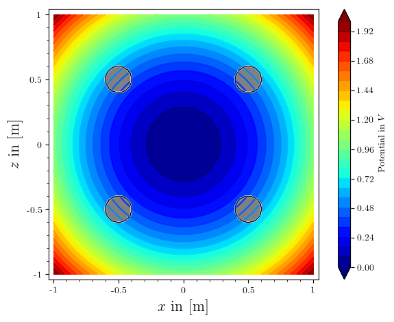
Hello, @stockh0lm. I am glad that you could use my last answer.
Let me give you a couple of solutions to your problems. I'll start with the easiest: As far as I'm aware, the frame and axes options are set globally. So when creating plot r, you are automatically overwriting this these options with the defaults, namely frame=False and axes=True. One way to solve this is just adding your preferences to the command that defines r:
r = region_plot(region_to_exclude, (x,-1,1), (z,-1,1),
            plot_points=300, incol="gray", bordercol="black", borderwidth=1, frame=True, axes=False)
That will solve your problem. However, a more elegant way to do this would be to use the same options you have put in show, but in save, i.e., the save command accepts the same options as the show command. In your case, you can use
bild.save('potentialfeld.pdf', axes=False, frame=True)
That way you can save time by not defining this these options for c and r repeatedly. (By the way, you don't need the line show(c + r,).) The result should be as follows (I didn't have the definition of your pic, so I used another function, but the idea is there):
(The code is located in this Sage Cell)
Now, let's try to solve the $x$ axis label problem. This is a little more complicated (I think). In this case, since you are not plotting axes, the $x$ label should go automatically to the bottom, so it will not interfere any more.anymore.
However, in case you do have a similar problem with another plot, I can suggest two alternatives. First, you could reposition the colorbar. If you want to do this, just add the line
opt['colorbar_options']['orientation'] = 'horizontal'
just after the line opt['colorbar_options']['label'] = 'Potential in $V$' (or just before, in any case). This will put the colorbar bellow your plot, so it will not interfere with axis labels.
A less elegant solution, but useful in some occations is to add line-breaks to the axis labels. Instead of putting axes_labels=['$x$ in [m]','$z$ in [m]']as an option for plot p, you could use axes_labels=['$x$\nin\n[m]','$z$ in [m]']. The \n defines a line-break in that precise place.
