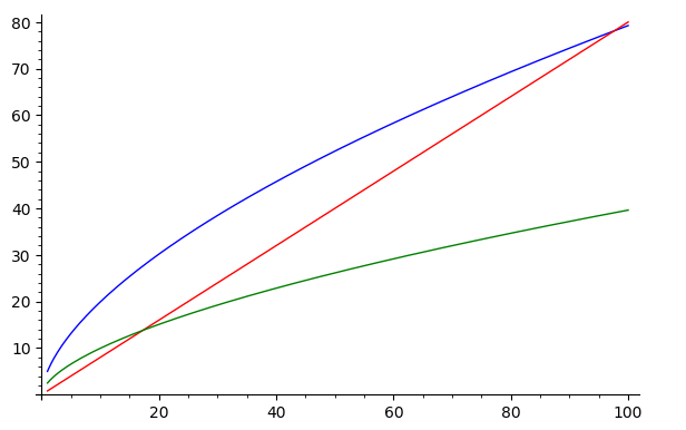
As some of the regulars on this forum could tell I've really gotten into sage for its appications to economics problems. I came up withthe following code for the Solow growth model in sage.
k,k1, alpha, A, delta, s, c=var('k,k1, alpha, A, delta, s, c')
#Initial Values
k=10
s=0.5
A=5
alpha=0.6
delta=0.8
#Equations of Interest
f(k)=A*k^alpha
k1=f(k)-(1-delta)*k
invest=s*f(k)
#Visualizing the Solow Model
prod=plot(f(k),(k,1,100),color='blue')
lom=plot(delta*k,(k,1,100),color='red')
savings=plot(invest,(k,1,100),color='green')
prod+lom+savings
I'm interested to see if I can make a dotted line from the x-axis and y-axis to show where the green and red lines intersect or even better display a number.
To visualize what I want I've used microsoft paint to aid my graphics below.
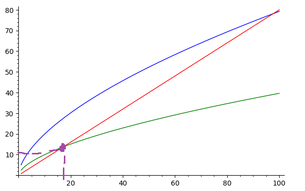
However this isn't the prettiest visualization and I'm wondering if I could get better graphics in sage. Any help is appreciated.
