following Juanjo's advice, I created a graphics_array.
Because i want to do a pairwise comparison with my graphs, i reordered them (with the zip). Now i have a 2xn array, with all the same x- and y-axis lables and also the same leged_labels, so I want to make it nice and put the legend_lable just in the bottom right plot and the left row gets the y-axis lable and the bottom row the x-axis lable.
here is my attempt at doing that.
l = []
k=1.0
p=plot(k*sin(x),(x,-pi,pi),axes_labels=['','$\\varphi$ in [V]'])
l.append(p)
k+=1
p=plot(k*sin(x),(x,-pi,pi))
l.append(p)
k+=1
p=plot(k*sin(x),(x,-pi,pi),axes_labels=['$z_c$ in [m]','$\\varphi$ in [V]'])
l.append(p)
k+=1
p=plot(k*sin(x),(x,-pi,pi), legend_label=['text'],axes_labels=['$z_c$ in [m]',''])
l.append(p)

ym = 1e+20
yM = 1e-20
for i in range(len(l)):
    bounds = l[i].get_minmax_data()
    ym = min(ym, bounds["ymin"])
    yM = max(yM, bounds["ymax"])

gpairs = list(zip(l[::2], l[1::2]))

pic=graphics_array(gpairs) # each plot uses its own vertical scale
graphics_array(gpairs).show(ymin=ym,ymax=yM, frame=True,figsize=[4,8],gridlines=True,typeset='latex',) # same scale for all plots
pic.save('pairwise-comp
This is the pic i get: 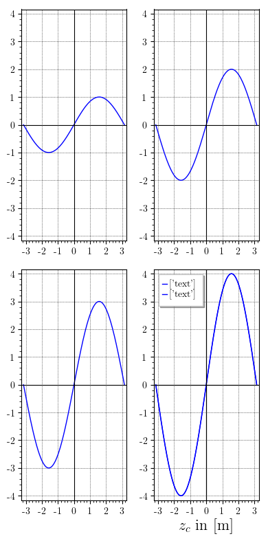
The labels on the y-axes are gone. only the bottom right has the x-axis lable. and the legend_lable is double in the bottom right.
I have not tried to decorate the rows with text left to the graphs and columns above the graphs.
is what i try to do feasable? or how can i do those things in LaTeX, outside sage? I dont see how i could do the ymin,ymax scaling in latex, but i could do that manually in sage and go back to individual graphs, if all else fails.

