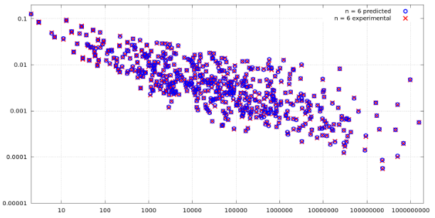
I have some numbers in two separate arrays, and I want to plot them in such a way that the end result looks more or less like this:
Currently, I have a code that looks like this:
res_blue = [...] # data for the blue crosses (removed for brevity)
res_red = [...] # data for the red crosses (removed for brevity)

list_plot(res_red, color='red')
But, instead the above code generates only plot with red dots. Any ideas how to plot something similar to the above image?
