Ask Your Question
1

I am trying to draw graphs of the following type: W = Z . Z^0.5+3i in my Jupyter Notebook. I really don't see how to do it.

asked 2026-02-19 01:14:26 +0100

wisher gravatar image

image description

edit retag flag offensive close merge delete

Comments

What does the "." represent in your formula?

John Palmieri gravatar imageJohn Palmieri ( 2026-02-20 02:26:09 +0100 )edit

The multiplcation I suppose.

wisher gravatar imagewisher ( 2026-02-21 11:39:59 +0100 )edit
1

Why not just write z^(1.5 + 0.3i)?

John Palmieri gravatar imageJohn Palmieri ( 2026-02-24 06:52:34 +0100 )edit

2 Answers

Sort by ยป oldest newest most voted
2

answered 2026-02-22 23:49:43 +0100

azerbajdzan gravatar image

updated 2026-02-22 23:52:45 +0100

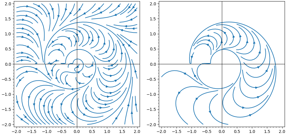
I think it is a kind of a stream plot. Unfortunately streamline_plot does not have appropriate options to make the plot look better.

Maybe choosing different start_points can help.

x, y, z, w = var('x y z w')
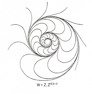
z = x + y*I
w = z*z^(1/2 + 3*I)
show(streamline_plot((w.real(), w.imag()), (x, -2, 2), (y, -2, 2), plot_points = 100, density = 1, aspect_ratio = 1))
streamline_plot((w.real(), w.imag()), (x, -2, 2), (y, -2, 2), plot_points = 100, density = 1.5, aspect_ratio = 1, start_points=[[0.130526, -0.991445], [0.382683, -0.92388], [0.608761, -0.793353], [0.793353, -0.608761], [0.92388, -0.382683], [0.991445, -0.130526], [0.991445, 0.130526], [0.92388, 0.382683], [0.793353, 0.608761], [0.608761, 0.793353], [0.382683, 0.92388], [0.130526, 0.991445], [-0.130526, 0.991445], [-0.382683, 0.92388], [-0.608761, 0.793353], [-0.793353, 0.608761], [-0.92388, 0.382683], [-0.991445, 0.130526], [-0.991445, -0.130526], [-0.92388, -0.382683], [-0.793353, -0.608761], [-0.608761, -0.793353], [-0.382683, -0.92388], [-0.130526, -0.991445]])

image description

edit flag offensive delete link more

Comments

1

I think you have found the correct way to draw these complex functions. Now I will consult the SageMath documentation and look into this issue further. Thank you very much for your response.

wisher gravatar imagewisher ( 2026-02-26 23:42:28 +0100 )edit
1

answered 2026-02-20 00:47:15 +0100

grmanifold1915 gravatar image

updated 2026-02-23 09:54:09 +0100

Max Alekseyev gravatar image

In the ipynb you can try this call in a cell and tweak the x and y ranges to get the proper graph:

complex_plot(lambda z: z*z^(0.5+3*i), (-3,3), (-2,2))
edit flag offensive delete link more

Comments

Do you mean lambda zz: ...?

John Palmieri gravatar imageJohn Palmieri ( 2026-02-20 02:27:50 +0100 )edit

Thank you for your reply. I get a color graph with the upper left quarter completely black (?), but it's not at all like the drawing you sent. Sorry, I don't know how to show you this result. Here is the script: complex_plot(lambda z: z*z^(0.5+3i), (-3,3), (-3,3))

wisher gravatar imagewisher ( 2026-02-20 14:57:41 +0100 )edit

Your Answer

Please start posting anonymously - your entry will be published after you log in or create a new account.

Add Answer

Question Tools

1 follower

Stats

Asked: 2026-02-19 01:14:26 +0100

Seen: 183 times

Last updated: Feb 23