How to plot similarity of two data sets in Sage?
I'm performing some simulations, and at the end I have a CSV file with three columns. One column holds the values for the x-axis, which was also input to the simulation and theoretical calculations, second one holds theoretically expected values, and the other column holds the values obtained by the simulation. I was planning to plot something like this:
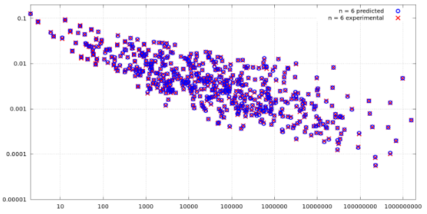
But that does not look good in my case, as the values in y-axis normally double, and the values for the x-axis exponentially increase, so most of the points end up getting collected at the lower left part, near the intersection of x-axis and y-axis of the plot. Therefore, I need a different way to plot such data, which will be more visually appealing and inform how close the simulation results are to the theoretical expected ones. For example, some of my values can be seen below:
x         = [2, 4, 8, 16, 32, 64] # partially removed for brevity
expected  = [47.9995, 95.9783, 191.9127, 383.9708, 767.8831] # partially removed for brevity
simulated = [48, 96, 191.8, 383.8, 767.4] # partially removed for brevity
What is a good way to plot such a data that doubles in the y-axis and exponentially increases on the x-axis all the time, and to view how similar the two datasets actually are?

I suppose your example figure shows
expectedandsimulatedon the y-axis with a third table giving the x-values. What do you mean by "the values normally double"? Do you mean that the corresponding values of expected and simulated are quite close to each other? If you plot the difference of expected and simulated against the x-values is that more informative? I also do not understand why points get collected near x=0 and y=0.@j.c. Yes,
expectedandsimulatedcorrespond to the values in the y-axis, and there are some integer values that are input to the simulation and theoretical calculations that is used to populate the x-axis. What I mean the values double is that you can see in the examples, the values for bothexpectedandsimulatedare quite close to each other, but every value keeps doubling, so it was 48, then 96, then 191, then 383, then 767, and so on. And the values on the x-axis also increase exponentially, so you can guess that all these smaller values correspond to smaller values of x, as the values of x increase exponentially, so on the right size we will have a point or to on the top right corner, and all the other points on the lower left corner.