Revision history [back]
| | 1 | initial version |
Hello. What I understand is that you want to put "Potential in $V$" as your colorbar legend (?). I have a little complicated form, but I think it will help you. Let me give you an example smaller than your plot:
var('y')
p = contour_plot(x^2+y^2,(x,-1,1), (y,-1,1), cmap=colormaps.jet, colorbar=True)
Now you have stored you contour plot inside the variable p. This variable actually is a list of plots (in this case, it just contains your single plot in p[0], but if you were to make something like p+=plot(x^2), then this second graphic would be stores in p[1], and so on). Let's separate your plot in another variable; you do this with:
plt = p[0]
Now you can access all the options of your plot. For example, if you type:
opt = plt.options()
print(opt)
you will see there is a part labeled "colorbar_options"; if you don't see it, you can just replace the last line with
opt['colorbar_options']
This is a Python list. We will add a field called "label" which will be the label of your colorbar. in this case:
opt['colorbar_options']['label'] = 'Potential in $V$'
That's it. Now you have to do the same steps backwards to apply the new options:
plt.set_options(opt)
p[0] = plt
Finally, you plot it:
p.show()
I'm sorry I didn't find another easier way to do this. However, you can wrap this code in a function (if you can't do it, let me know so I can send it to you). If I find another way, I'll write it.
I hope this helps!
| | 2 | No.2 Revision |
Hello. What I understand is that you want to put "Potential in $V$" as your colorbar legend (?). I have a little complicated form, but I think it will help you. Let me give you an example smaller than your plot:
var('y')
p = contour_plot(x^2+y^2,(x,-1,1), (y,-1,1), cmap=colormaps.jet, colorbar=True)
Now you have stored you contour plot inside the variable p. This variable actually is a list of plots (in this case, it just contains your single plot in p[0], but if you were to make something like p+=plot(x^2), then this second graphic would be stores in p[1], and so on). Let's separate your plot in another variable; you do this with:
plt = p[0]
Now you can access all the options of your plot. For example, if you type:
opt = plt.options()
print(opt)
you will see there is a part labeled "colorbar_options"; if you don't see it, you can just replace the last line with
opt['colorbar_options']
This is a Python list. We will add a field called "label" which will be the label of your colorbar. in this case:
opt['colorbar_options']['label'] = 'Potential in $V$'
That's it. Now you have to do the same steps backwards to apply the new options:
plt.set_options(opt)
p[0] = plt
Finally, you plot it:
p.show()
The result should be like this:
You can also check the whole code in this Sage Cell page: Contour plot with labelled colorbar
I'm sorry I didn't find another easier way to do this. However, you can wrap this code in a function (if you can't do it, let me know so I can send it to you). If I find another way, I'll write it.
I hope this helps!
| | 3 | No.3 Revision |
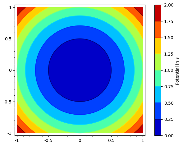
Hello. What I understand is that you want to put "Potential in $V$" as your colorbar legend (?). I have a little complicated form, but I think it will help you. Let me give you an example smaller than your plot:
var('y')
p = contour_plot(x^2+y^2,(x,-1,1), (y,-1,1), cmap=colormaps.jet, colorbar=True)
Now you have stored you contour plot inside the variable p. This variable actually is a list of plots (in this case, it just contains your single plot in p[0], but if you were to make something like p+=plot(x^2), then this second graphic would be stores in p[1], and so on). Let's separate your plot in another variable; you do this with:
plt = p[0]
Now you can access all the options of your plot. For example, if you type:
opt = plt.options()
print(opt)
you will see there is a part labeled "colorbar_options"; if you don't see it, you can just replace the last line with
opt['colorbar_options']
This is a Python list. dict. We will add a field called "label" which will be the label of your colorbar. in In this case:
opt['colorbar_options']['label'] = 'Potential in $V$'
That's it. Now you have to do the same steps backwards to apply the new options:
plt.set_options(opt)
p[0] = plt
Finally, you plot it:
p.show()
The result should be like this:
You can also check the whole code in this Sage Cell page: Contour plot with labelled colorbar
I'm sorry I didn't find another easier way to do this. However, you can wrap this code in a function (if you can't do it, let me know so I can send it to you). If I find another way, I'll write it.
I hope this helps!
