One could compute f(x) for a list of x along the interval.
Then add intermediate points until the angle difference
between any two successive f(x) is small enough.
Finally, draw a line segment of the appropriate color
to join each pair of points. The collection of these colored
line segments gives the desired plot.
Here is a function to do that.
def plot_cx(f, x_range, plot_points=200, epsilon_turn=1/32, **opt):
r"""
Return a plot of this complex-valued function of one real variable.
The plot is a plot $y = abs(f(x))$ with varying line color
indicating the argument of $f(x)$.
Assumes $f$ is nonzero along the interval, and its argument
varies not too steeply.
INPUT:
- ``f`` -- a complex-valued function of one real variable
- ``x_range`` -- the range for the variable `x`, a pair ``(xmin, xmax)``
- ``plot_points`` -- number of points in the initial subdivision
- ``epsilon_turn`` -- threshold for how far to refine the subdivision:
we refine until the angle between the images of two successive points
is less than ``epsilon_turn`` turns
EXAMPLES::
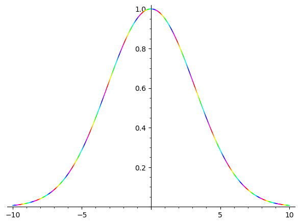
sage: f(x) = exp(5*i*x) * exp(-x^2/20) # complex gaussian wave packet
sage: plot_cx(f, (-10, 10))
Launched png viewer for Graphics object consisting of 796 graphics primitives
"""
from more_itertools import pairwise
xmin, xmax = x_range
xmin = RDF(xmin)
xmax = RDF(xmax)
h = (xmax - xmin) / (plot_points - 1)
data = [(x, f(x)) for x in srange(xmin, xmax - h/2, h)]
data.append((xmax, f(xmax)))
pi = math.pi
tau = math.tau
n = 0
nn = 1
while nn < len(data):
x, z = data[n]
xx, zz = data[nn]
while abs(arg(zz / z))/tau > epsilon_turn:
xx = (x + xx) / 2
zz = f(xx)
data.insert(nn, (xx, zz))
n += 1
nn += 1
return sum(line2d([(x, abs(z)), (xx, abs(zz))], hue=(pi + arg(z))/tau, **opt)
for (x, z), (xx, zz) in pairwise(data))
Usage:
sage: f(x) = exp(5*i*x) * exp(-x^2/20)
sage: p = plot_cx(f, (-10, 10))
sage: p.show()
Launched png viewer for Graphics object consisting of 796 graphics primitives