Revision history [back]
| | 1 | initial version |
I'm not sure what you mean by overlapping vertices. The issue I see is that the labels are too big for the vertices. With respect to edge crossings, the graph is nonplanar so there will always be edge crossings. Two features you'll want to make your graphs look better are increasing the vertex size and increasing the figure size (so that vertices will be more spread apart. Try the following code:
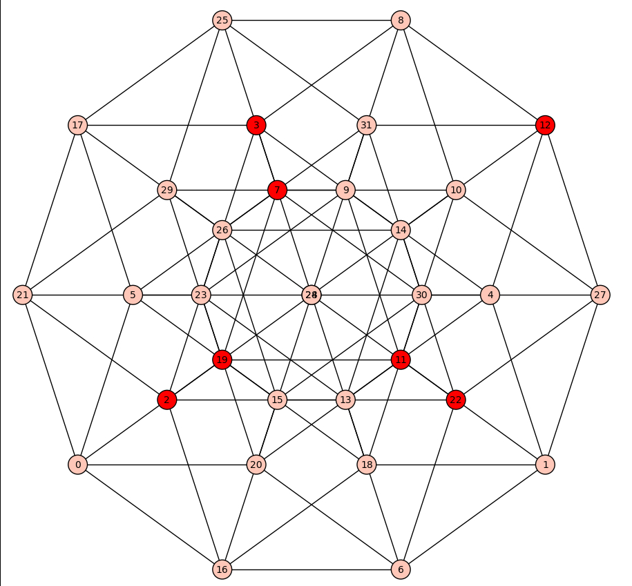
g1 = graphs.CubeGraph(5)
g1.relabel()
m=g1.dominating_set()
g1.plot(vertex_colors={"red": m}, vertex_size=400, figsize=[9,9])
The vertex_size=400 has increased the size of the vertices so that the labels fit better. You can, of course, use a larger number. Likewise figsize=[9,9] is setting how big the graphics will be. The result is
You can adjust the figsize to make it smaller or larger.
To make your graphs even nicer, you can use LaTeX. An example can be found here using sagetex combined with Sage and LaTeX to produce the Petersen graph.
| | 2 | No.2 Revision |
I'm not sure what you mean by overlapping vertices. The issue I see is that the labels are too big for the vertices. With respect to edge crossings, the graph is nonplanar so there will always be edge crossings. Two features you'll want to make your graphs look better are increasing use 3 useful tweaks in making graphs: 1. Adjust the vertex size and increasing size, 2. Adjust the figure size (so that distance between vertices, 3. arrange the vertices will be more spread apart. around a circle. Try the following code:
g1 = graphs.CubeGraph(5)
g1.relabel()
m=g1.dominating_set()
g1.set_pos(g1.layout_circular())
g1.plot(vertex_colors={"red": m}, vertex_size=400, figsize=[9,9])
figsize=[8,8])
The
- was done with
vertex_size=400figsize=[9,9]figsize=[8,8]g1.set_pos(g1.layout_circular()) to give a circular layout. The result of the code is below: 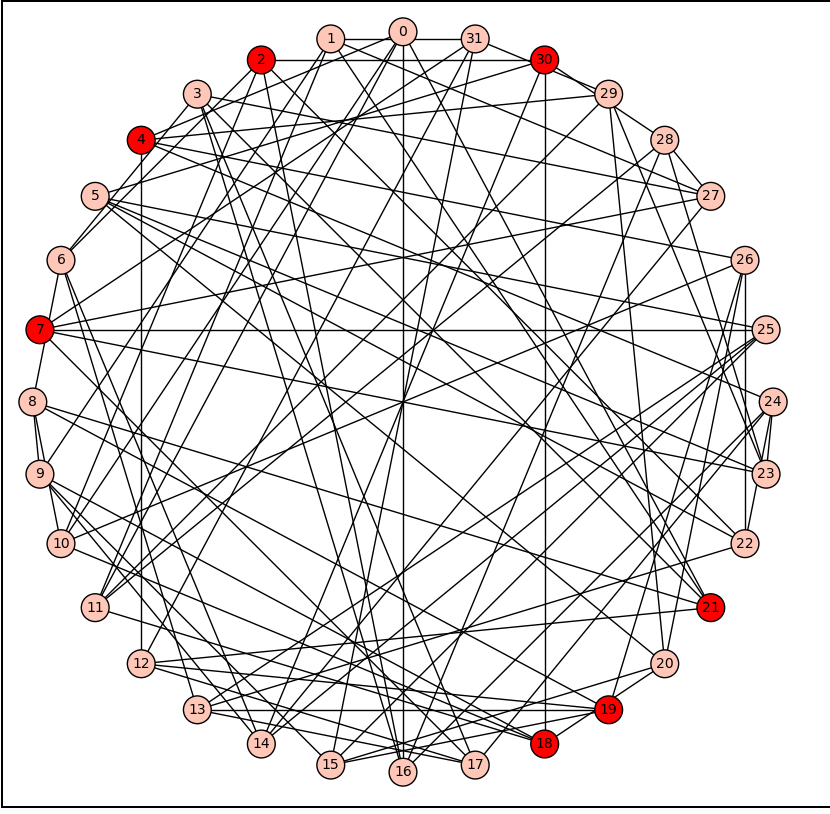
You can adjust the figsize to make it smaller or larger.
To make your graphs even nicer, you can use LaTeX. An example can be found here using sagetex combined with Sage and LaTeX to produce the Petersen graph.
