I have
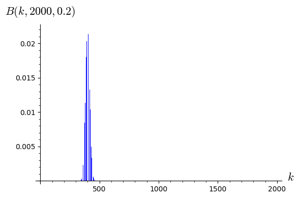
reset()
import scipy.stats
n = 2000
p = 0.2
binom_dist = scipy.stats.binom(n,p)
bar_chart([binom_dist.pmf(x) for x in range(n)], axes_labels=['$k$','$B(k,{},{})$'.format(n,float(p))])
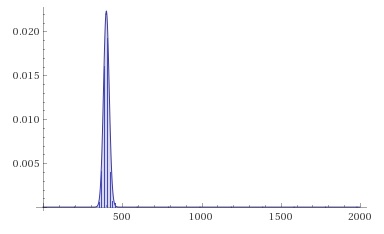
How could I create something nicer, like
| | 1 | initial version |
I have
reset()
import scipy.stats
n = 2000
p = 0.2
binom_dist = scipy.stats.binom(n,p)
bar_chart([binom_dist.pmf(x) for x in range(n)], axes_labels=['$k$','$B(k,{},{})$'.format(n,float(p))])
How could I create something nicer, like
 Copyright Sage, 2010. Some rights reserved under creative commons license. Content on this site is licensed under a Creative Commons Attribution Share Alike 3.0 license.