Ask Your Question
1

how to fill region with color

asked 2021-01-16 09:11:13 +0200

ortollj gravatar image

HI

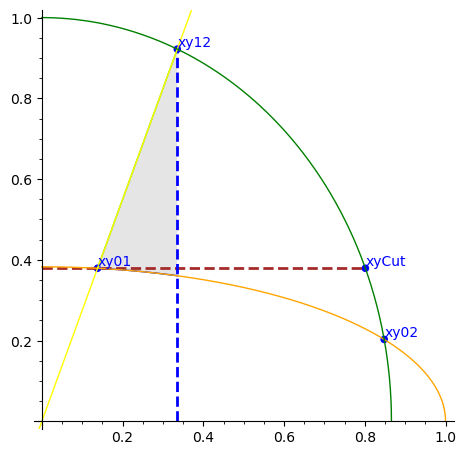
how to fill in gray only the region between the yellow curve the orange curve and the blue dashed line ?

var('x')
PtsL=[[0.13795, 0.37902], [0.33554, 0.92189], [0.84803, 0.2028], [0.80141, 0.37902]]
PtsNamesL=['xy01','xy12','xy02','xyCut']
ellipse0=1/2*sqrt(-x^2 + 1)*sqrt(-sqrt(2) + 2)
ellipse1=x*cos(1/9*pi)/sin(1/9*pi)
ellipse2=sqrt(-4/3*x^2 + 1)
plt=list_plot(PtsL,color='blue',size=30)
for i in range(len(PtsL)) :
    plt+=text(PtsNamesL[i],vector(PtsL[i])*1.05, color='blue')


plt+=line([[0,PtsL[3][1]],PtsL[3]],color='brown',thickness=2,linestyle='dashed')
plt+=line([[PtsL[1][0],0],PtsL[1]],color='blue',thickness=2,linestyle='dashed')
plt+=plot([ellipse0, ellipse1,ellipse2], 0,1, fill={0: [1]}, fillcolor='#ccc')
plt+=plot(ellipse0,color='orange')
plt+=plot(ellipse1,color='yellow')
plt+=plot(ellipse2,color='green')

show(plt,xmin=0,xmax=1,ymin=0,ymax=1)
edit retag flag offensive close merge delete

2 Answers

Sort by ยป oldest newest most voted
2

answered 2021-01-16 10:51:08 +0200

slelievre gravatar image

updated 2021-01-16 13:52:13 +0200

For the shaded region, use the interval [x01, x12] instead of [0, 1].

Besides, use parametric plots for nicer ellipse arcs than when plotted as function graphs.

Indeed, plotting functions with vertical tangents typically goes wrong near those tangencies.

Here is some amended code.

var('x')
pts = [(0.13795, 0.37902), (0.33554, 0.92189), (0.84803, 0.2028), (0.80141, 0.37902)]
pt_names = ['xy01', 'xy12', 'xy02', 'xyCut']
A0, B0 = 1, (2 - sqrt(2))/4
A2, B2 = 3/4, 1
f0 = sqrt((1 - x^2/A0)*B0)
f1 = x*cot(pi/9)
f2 = sqrt((1 - x^2/A2)*B2)
plt = point2d(pts, color='blue', size=30)
pt_opt = {'color': 'blue', 'horizontal_alignment': 'left', 'vertical_alignment': 'bottom'}
plt += sum(text(name, vector(pt), **pt_opt) for name, pt in zip(pt_names, pts))
plt += line([[0, pts[3][1]], pts[3]], color='brown', thickness=2, linestyle='dashed')
plt += line([[pts[1][0], 0], pts[1]], color='blue', thickness=2, linestyle='dashed')
fill_opt = {'fillcolor': 'lightgrey', 'thickness': 0}
plt += plot([f0, f1], (pts[0][0], pts[1][0]), fill={0: [1]}, **fill_opt)
ell0 = (lambda t: sqrt(A0)*cos(t), lambda t: sqrt(B0)*sin(t))
plt += parametric_plot(ell0, (0, pi/2), color='orange')
plt += plot(f1, color='yellow')
ell2 = (lambda t: sqrt(A2)*cos(t), lambda t: sqrt(B2)*sin(t))
plt += parametric_plot(ell2, (0, pi/2), color='green')
plt.show(xmin=0, xmax=1, ymin=0, ymax=1, aspect_ratio=1, figsize=8)

Shaded region between ellipse and two lines

edit flag offensive delete link more

Comments

thank you @slelievre

ortollj gravatar imageortollj ( 2021-01-16 11:01:19 +0200 )edit

@slelievre But rather than:

A0=1;B0=(sqrt(-sqrt(2) + 2)/2)^2
ell0 = (lambda t: sqrt(A0)*cos(t), lambda t: sqrt(B0)*sin(t))
plt += parametric_plot(ell0, (0, pi/2), color='orange')
plt.show(xmin=0, xmax=1, ymin=0, ymax=1, aspect_ratio=1, figsize=8)

I prefer :

plt+=implicit_plot(ellipse0-y,(x,0,1),(y,0,1),color='orange')
plt.show(xmin=0, xmax=1, ymin=0, ymax=1, aspect_ratio=1, figsize=8)

what do you think ?

ortollj gravatar imageortollj ( 2021-01-16 13:52:18 +0200 )edit
1

Implicit plots require sampling a whole region to spot the places where some function of x and y is zero, while parametric plots directly give points on a curve and join them.

So I tend to favour parametric plot for efficiency and precision.

Using implicit plot is sometimes convenient. If using it to plot an ellipse, I would take advantage of not having to express $y$ as a function of $x$, and use

implicit_plot(lambda x, y: x^2/A0 + y^2/B0 - 1, (0, 1), (0, 1), color='orange')

or

x, y = var('x, y')
implicit_plot(x^2/A0 + y^2/B0 - 1, (x, 0, 1), (y, 0, 1), color='orange')

to avoid many square root computations.

slelievre gravatar imageslelievre ( 2021-01-16 17:36:24 +0200 )edit
ortollj gravatar imageortollj ( 2021-01-16 17:50:08 +0200 )edit
0

answered 2021-01-16 16:48:18 +0200

ortollj gravatar image

updated 2021-01-16 16:51:00 +0200

therefore after the solutions and advices of @slelievre gave me (and above all much more elegant than my initial code, thank you again @slelievre), I prefer the following code (more concise !):

var('x,y')
PtsL = [[0.13795, 0.37902], [0.33554, 0.92189], [0.84803, 0.2028], [0.80141, 0.37902]]
PtsNamesL = ['xy01', 'xy12', 'xy02', 'xyCut']
ellipse0 = 1/2*sqrt(-x^2 + 1)*sqrt(-sqrt(2) + 2)
ellipse1 = x*cos(1/9*pi)/sin(1/9*pi)
ellipse2 = sqrt(-4/3*x^2 + 1)
plt = list_plot(PtsL, color='blue', size=30)
pt_opt = {'color': 'blue', 'horizontal_alignment': 'left', 'vertical_alignment': 'bottom'}
plt += sum(text(name, vector(pt), **pt_opt) for name, pt in zip(PtsNamesL, PtsL))
plt += line([[0, PtsL[3][1]], PtsL[3]], color='brown', thickness=2, linestyle='dashed')
plt += line([[PtsL[1][0], 0], PtsL[1]], color='blue', thickness=2, linestyle='dashed')
plt += plot([ellipse0, ellipse1], (PtsL[0][0], PtsL[1][0]), fill={0: [1]}, fillcolor='#ccc', fillalpha=.3)
plt+=implicit_plot(ellipse0-y,(x,0,1),(y,0,1),color='orange')
plt+=plot(ellipse1,color='yellow')
plt+=implicit_plot(ellipse2-y,(x,0,1),(y,0,1),color='green')
plt.show(xmin=0, xmax=1, ymin=0, ymax=1, aspect_ratio=1, figsize=8)
edit flag offensive delete link more

Comments

2

The green and orange ellipses can be simply plotted with

plt += arc((0,0), sqrt(A0), sqrt(B0), sector=(0,pi/2), color="orange")
plt += arc((0,0), sqrt(A2), sqrt(B2), sector=(0,pi/2), color="green")
Juanjo gravatar imageJuanjo ( 2021-01-16 17:11:08 +0200 )edit

Thank you @Juanjo

ortollj gravatar imageortollj ( 2021-01-16 17:48:27 +0200 )edit

Your Answer

Please start posting anonymously - your entry will be published after you log in or create a new account.

Add Answer

Question Tools

1 follower

Stats

Asked: 2021-01-16 09:11:13 +0200

Seen: 680 times

Last updated: Jan 16 '21