How can I avoit the scientific notation on the y-axis?

Example: plot(exp(0.017*x), (x,0,2000))
add a comment
Example: plot(exp(0.017*x), (x,0,2000))
You can use the matplotlib function FormatStrFormatter. This uses old-style Python formatting. The first argument is for the x-axis, the second for the y-axis. Using None gives the default setting.
sage: P = plot(exp(0.017*x), (x,0,2000))
sage: from matplotlib.ticker import FormatStrFormatter
sage: P.SHOW_OPTIONS['tick_formatter']=(None, FormatStrFormatter('%d'))
sage: P
I think it looks pretty horrible this way, and I would stick with scientific notation, as Emmanuel Charpentier said.
Or you can use matplotlib.ticker.StrMethodFormatter and new-style formatting: P.SHOW_OPTIONS['tick_formatter']=(None, StrMethodFormatter('{x:.2f}')).
For this particular graph, the axis has labels '1e14', '2e14', '3e14', etc.
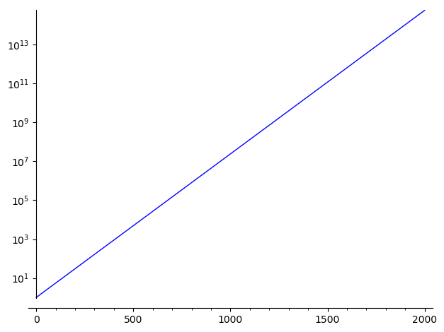
An alternative is to use the log scale on the y-axis:
sage: plot(exp(0.017*x), (x,0,2000), scale="semilogy")
Note that you may change the base of the logarithm this way:
sage: plot(exp(0.017*x), (x,0,2000), scale=("semilogy",3))

See documentation of plot? for more information.
I want to show the dramatic of the growth of population. With the log-scaling, this is not visible for most eyes. So I found
sage: P = plot(exp(0.0178x)1.9833/10^15, (x,0,2100)) ....: from matplotlib.ticker import FormatStrFormatter ....: P.SHOW_OPTIONS['tick_formatter']=(None, FormatStrFormatter('%d' " Mrd.")) ....: P,
which does a good 'job'. (Sorry, I don't know how to set a graphik into a comment)
Well...
sage: e^(2000*0.017).n()
5.83461742527455e14
Do yoy really need 14-digits wide y-axis markers ?
Thanks for the response. Unfortunately, within the plotcommand, plot(exp(0.017*x),(x,0,2000)).n() I get the following message AttributeError: 'Graphics' object has no attribute 'n'
Please start posting anonymously - your entry will be published after you log in or create a new account.
Asked: 2019-02-05 18:26:50 +0200
Seen: 963 times
Last updated: Feb 06 '19
Dancing x-axis in animation [solved]
How can I add arrows at the end of sage plot axis?
Define range of y axis, instead of just x axis?
Determine the y-value at the maximum? [closed]
How to Change Ticks for Y axis Only?
function for removing scientific notation
Scale axis width=1 and height=1
How to remove scientific notation when numerically approximating
 Copyright Sage, 2010. Some rights reserved under creative commons license. Content on this site is licensed under a Creative Commons Attribution Share Alike 3.0 license.
