Revision history [back]
| | 1 | initial version |
Hello, @rob! One possible way to solve your problem is to override Sage's LaTeX engine and to let the formula rendering work be taken care of by your own LaTeX installation. Here is what you have to do:
from matplotlib import rc
rc('text', usetex=True)
plot(x^2, legend_label=r'$\left[\begin{array}{r}1\\0\end{array}\right]$')
Since Sage uses the Matplotlib library to create its plots, we first import the rc function, which allows us to set specific configurations, which is exactly what we do in the second line, specifying that all text in plots will be rendered using LaTeX. The third line is just the plot of the function x^2 (I picked it up randomly just for the purpose of example), and the legend label you wanted to use. This should be the result:
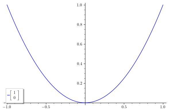
There are some downsides to this solution: First, this is not a rendering in the proper sense; what actually happens is that Matplotlib creates a LaTeX document with the code for your matrix, it compiles it on-the-fly, extracts and converts the formula to png, and finally includes the result in your plot. This leads me to the second downside: you need a LaTeX installation with the dvipng program installed, along with a couple of packages (type1cm and super-cm, if I remember correctly). As a consequence, this method doesn't work on SageCell, which has no type1ec package installed (hopefully, one day, it will be installed). However, this should work if you have a local installation of Sage and LaTeX, or you could just use CoCalc.
I would like to use the opportunity to give you a couple of suggestions. First, I am not very happy with the idea of using a matrix or vector in a legend label. Remember: scientific graphics (in particular, legend labels) are supposed to convey as much information as possible, but in the most compact and efficient way. Cluttering the plot with matrices defeats the purpose. I would suggest (if possible), using a simpler legend like just "$A$", and then using the figure caption (or the text surrounding the plot) to indicate what is $A$---for example, that is the way to go if you are writing a scientific paper. However, if you definitely require to use matrix notation, you can use the all-important transposition, writing $[1 0]^t$, or $[1 0]^T$, or $[1 0]'$, depending on your preferences on notation.
Finally, one last suggestion: SageMath (and also you in your example code) tends to use the array environment from LaTeX, and uses \left[ and \right] to produce the surrounding brackets. I recommend you to use the more modern and more carefully designed bmatrix environment (bmatrix stands for "bracketed matrix"). There are also pmatrix (parenthesized matrix), vmatrix (vertically lined matrix), etc. These environments are defined in the amsmath package, so you will need to tell Matplotlib to use it:
from matplotlib import rc
rc('text', usetex=True)
rc('text.latex', preamble=r'\usepackage{amsmath}')
plot(x^2, legend_label=r'$\begin{bmatrix}1\\0\end{bmatrix}$')
The code is self-explanatory. The result is this:
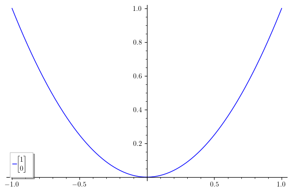
Notice the more compact and elegant matrix. Also, notice that bmatrix and its siblings don't require alignment arguments; they are fined-tuned to standard mathematical notation.
I hope this helps!
