Revision history [back]
| | 1 | initial version |
Hello, @Alex89! The problem seems to be Jupyter not being able to handle R's plot command interactively. I tried the following:
x = r([1,2,3,4,5])
y = r([2,3,4,5,2])
r.plot(x)
I got the null device 1 message, but my home folder (where I opened the Jupyter Notebook) now has a file called Rplot001.png. So, Jupyter is delegating the plotting to another output (PNG in this case).
However, I have an alternative for you:
x = r([1,2,3,4,5])
y = r([2,3,4,5,2])
list_plot(x.sage(), size=50)
The first two commands create R objects x and y. You can work with them in R language. For example,
print(~x)
print(x.mean())
print(x.var())
will print
[1] 1.0000000 0.5000000 0.3333333 0.2500000 0.2000000
[1] 3
[1] 2.5
Anyway, going back to the first piece of code, if you want to create an interactive plot in Jupyter, you should do it through Sage. If you see the last line, I first converted the R object x to a Sage object with x.sage(), and then I used the list_plot() command from Sage, which creates a plot similar to R's plot() command.
I hope this helps!
| | 2 | No.2 Revision |
Hello, @Alex89! The problem seems to be Jupyter not being able to handle R's plot command interactively. I tried the following:
x = r([1,2,3,4,5])
y = r([2,3,4,5,2])
r.plot(x)
I got the null device 1 message, but my home folder (where I opened the Jupyter Notebook) now has a file called Rplot001.png. So, Jupyter is delegating the plotting to another output (PNG in this case).
However, I have an alternative for you:
x = r([1,2,3,4,5])
y = r([2,3,4,5,2])
list_plot(x.sage(), size=50)
The first two commands create R objects x and y. You can work with them in R language. For example,
print(~x)
print(x.mean())
print(x.var())
will print
[1] 1.0000000 0.5000000 0.3333333 0.2500000 0.2000000
[1] 3
[1] 2.5
Anyway, going back to the first piece of code, if you want to create an interactive plot in Jupyter, you should do it through Sage. If you see the last line, I first converted the R object x to a Sage object with x.sage(), and then I used the list_plot() command from Sage, which creates a plot similar to R's plot() command.
If you want a more R-looking plot, you can play with some options. For example,
list_plot(x.sage(), size=50, faceted=True, color='white', markeredgecolor='blue')
produces
I hope this helps!
| | 3 | No.3 Revision |
Hello, @Alex89! The problem seems to be Jupyter not being able to handle R's plot command interactively. I tried the following:
x = r([1,2,3,4,5])
y = r([2,3,4,5,2])
r.plot(x)
I got the null device 1 message, but my home folder (where I opened the Jupyter Notebook) now has a file called Rplot001.png. So, Jupyter is delegating the plotting to another output device (PNG in this case).
However, I have an alternative for you:
x = r([1,2,3,4,5])
y = r([2,3,4,5,2])
list_plot(x.sage(), size=50)
The first two commands create R objects x and y. You can work with them in R language. For example,
print(~x)
print(x.mean())
print(x.var())
will print
[1] 1.0000000 0.5000000 0.3333333 0.2500000 0.2000000
[1] 3
[1] 2.5
Anyway, going back to the first piece of code, if you want to create an interactive plot in Jupyter, you should do it through Sage. If you see the last line, I first converted the R object x to a Sage object with x.sage(), and then I used the list_plot() command from Sage, which creates a plot similar to R's plot() command.
If you want a more R-looking plot, you can play with some options. For example,
list_plot(x.sage(), size=50, faceted=True, color='white', markeredgecolor='blue')
produces
I hope this helps!
EDIT: As you can see on the figure, Sage's list_plot assumes the default domain for the plot is ${0, 1, 2, 3, \ldots}$, while R's plot assumes it to be ${1, 2, 3, \ldots}$. If you want to specify a different domain, you can check this related question. In particular, you can do
xs = x.sage()
xx = [(i+1,xs[i]) for i in range(len(xs))]
list_plot(xx, size=50, faceted=True, color='white', markeredgecolor='blue')
to use R's default domain, ${1, 2, 3, \ldots}$.
| | 4 | No.4 Revision |
Hello, @Alex89! The problem seems to be Jupyter not being able to handle R's plot command interactively. I tried the following:
x = r([1,2,3,4,5])
y = r([2,3,4,5,2])
r.plot(x)
I got the null device 1 message, but my home folder (where I opened the Jupyter Notebook) now has a file called Rplot001.png. So, Jupyter is delegating the plotting to another output device (PNG in this case).
However, I have an alternative for you:
x = r([1,2,3,4,5])
y = r([2,3,4,5,2])
list_plot(x.sage(), size=50)
The first two commands create R objects x and y. You can work with them in R language. For example,
print(~x)
print(x.mean())
print(x.var())
will print
[1] 1.0000000 0.5000000 0.3333333 0.2500000 0.2000000
[1] 3
[1] 2.5
Anyway, going back to the first piece of code, if you want to create an interactive plot in Jupyter, you should do it through Sage. If you see the last line, I first converted the R object x to a Sage object with x.sage(), and then I used the list_plot() command from Sage, which creates a plot similar to R's plot() command.
If you want a more R-looking plot, you can play with some options. For example,
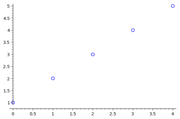
list_plot(x.sage(), size=50, faceted=True, color='white', markeredgecolor='blue')
produces
I hope this helps!
EDIT:EDIT (for completeness): As you can see on the figure, Sage's list_plot assumes the default domain for the plot is ${0, 1, 2, 3, \ldots}$, while R's plot plot assumes it to be ${1, 2, 3, \ldots}$. If you want to specify a different domain, you can check this related question. In particular, you can do
xs = x.sage()
xx = [(i+1,xs[i]) for i in range(len(xs))]
list_plot(xx, size=50, faceted=True, color='white', markeredgecolor='blue')
to use R's default domain, ${1, 2, 3, \ldots}$.
